Zero Waste
Overview
As part of the Laurier Design for Change Challenge, my team and I were challenged to shift users towards greener behavior and more environmentally sustainable practices.
Zero Waste is a reverse vending machine that rewards users with points for recycling empty beverage containers like bottles or cans. Using the Zero Waste mobile app, users can collect, track, and redeem points for rewards in the form of gift cards/discount codes, progress through four tiers with unique perks, compete with friends on an online leaderboard, and see their quantifiable impact towards the environment.
Our team was one of the top 10 finalists out of 52 teams in total.
Lead UX/UI Designer, User Research, Prototyping & Testing
My Role💡
Adobe XD, Figma, Photoshop, illustrator, premier pro, Autodesk 3ds Max
Tools🛠
Chemical engineer, Business Analysis
Team🤝
One Month (March 2021)
Duration⏳
Design Challenge Question
How might we create social transformation that shifts users towards greener behavior and sustainable practices?
Our Approach
1) Environmental solutions are not practical
We realized through brainstorming that many environmental solutions are not practical for the average person who values time and convenience. For example, not everyone is willing to carpool or take public transport instead of driving their car to work to reduce pollution.
2) Understanding the problem through secondary research
We found that the main reasons people aren’t doing more to help the environment are because of a lack of time, a knowledge deficit of environmental issues with an astounding 40% of adults globally not knowing what climate change is, and the mentality that one’s actions don’t make a difference.
3) Focusing on recycling
So we thought to ourselves: what is one of the most practical and simplest ways for people to make a large impact to the environment? Then it struck us. Recycling. Something as simple as recycling a single glass bottle can help reduce air and water pollution by 20% and 50% respectively!
Despite recycling seeming simple in theory, many people still don’t do it.
Of plastic is NOT recycled around the world, resulting in the death of 100,000 marine animals every year
91%
Tons of litter ends up in the ocean every year.
9 Billion
Of people globally have admitted to littering in the last 5 years
75%
Tons of garbage is generated in Canada each year, in which only 30% of that is recycled
31 Million
After discovering such alarming statistics, we wanted to understand how we can help encourage recycling through a long-term solution that aims to ultimately change people’s behaviour. To do so, we first examined and analyzed why people don't recycle through surveys and user interviews.
Why people don’t recycle?
User Research
People don’t recycle because it is inconvenient and time-consuming, confusing, inaccessible and boring.
The main motivators for recycling are getting rewarded for it through money or points, being more educated through awareness campaigns, and making recycling more exciting.
User Quotes - From Interviews
"If an app showed me that I'm improving my life in some kind of way or that I'm doing something good for the world, that would excite me just as much as a reward."
MOHAMMED | GAME DESIGN STUDENT
"People are too lazy in today’s day and age with the world being full of advanced technologies. I believe that people in my age group need solutions to be as simple as possible, while also offering some sort of tangible benefit.”
SIMBA | BUSINESS STUDENT
"What I love about Honey (Rewards) is that even if the software is not able to find discount codes for you, the user is still able to accumulate points. Even though I sometimes don’t use the points, just the fact that the user is being rewarded is enough for me to keep using the app. It’s like a game.”
DIEGO | GRADUATE
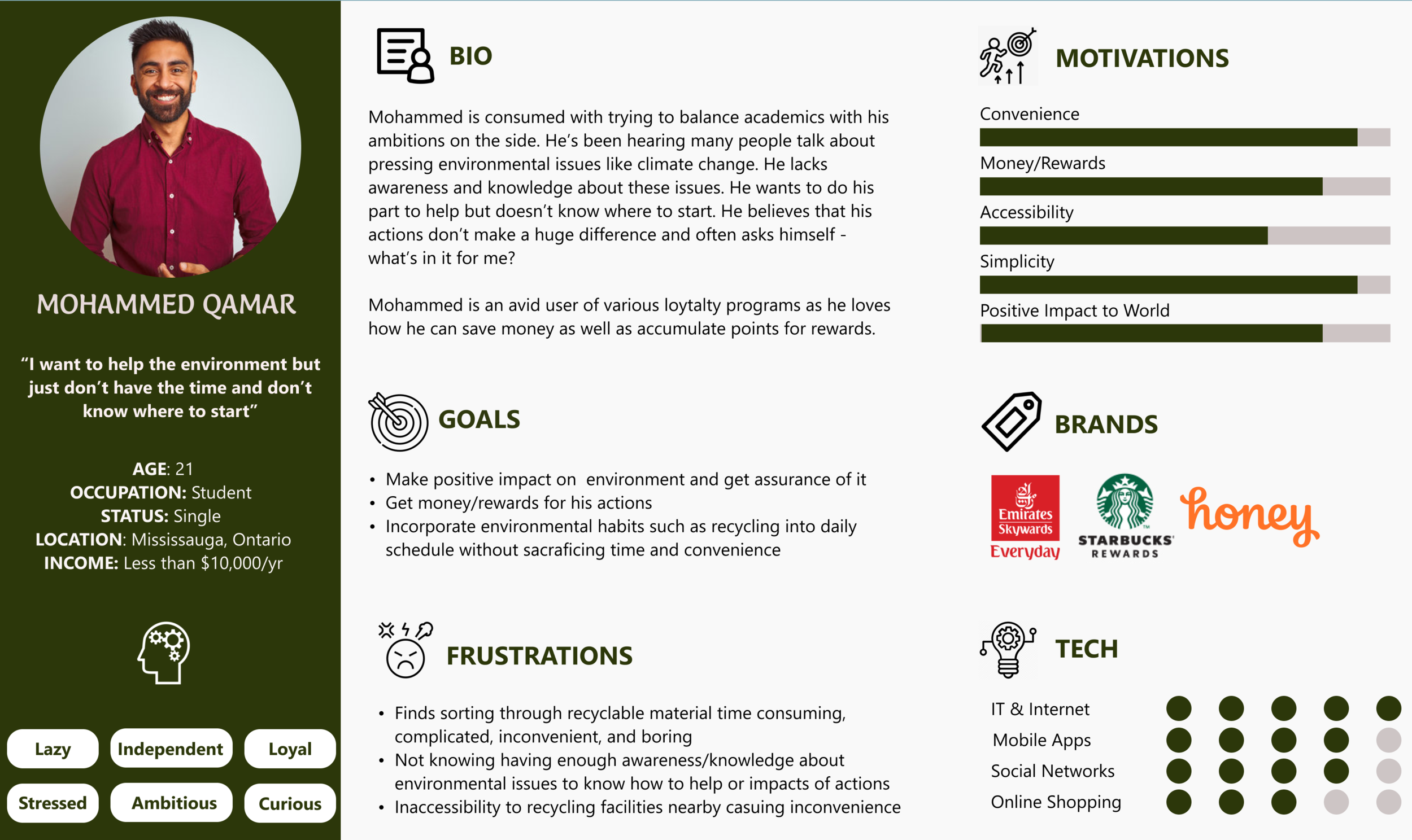
User Persona
We created a persona based on our surveys and user interviews which helped ensure that users’ goals and frustrations were at the front of our minds as we progressed with the design.
User Journey Map
I created a short animation to showcase the typical user journey of Mohammed who is doing his weekly grocery shopping but experiences a dilemma when it comes time for garbage day. This helped my team look at the problem from the user’s point of view at every step of the recycling journey and fully immerse ourselves within the users’ pain points.
Coming up with a Solution
Based on our research findings, we knew we had to come up with a solution that would reward people for recycling while also being convenient, simple, educational, and most importantly, exciting.
We discovered a product known as the Reverse Vending Machine. Unlike a normal vending machine that takes in a deposit and gives you a beverage in return, a reverse vending machine provides users with money for recycling empty beverage containers like bottles, cans, and glass. It does this by scanning the barcodes of containers through built-in cameras. We were intrigued by this idea and decided to explore it further.
COMPETITIVE ANALYSIS
We analyzed several reverse vending machine companies in the market to evaluate the weaknesses of their products and how we can improve upon them in our solution.
Existing reverse vending machines have very long processing times, are inconvenient due to separate designated machines for each container type, and lack a solid digital platform to keep users engaged and excited in the long term.
HOW OUR MACHINE IS DIFFERENT
Mobile Application
To take advantage of the fact that competitors don’t have a solid digital platform, we started thinking of potential features for a digital solution that could be paired with the reverse vending machine. We decided to create a mobile app that would reward users with points for recycling empty beverage containers like bottles or cans. The features had to address the main pain points which are that recycling is boring, confusing, inconvenient, and not rewarding.
01. Loyalty Program and Rewards
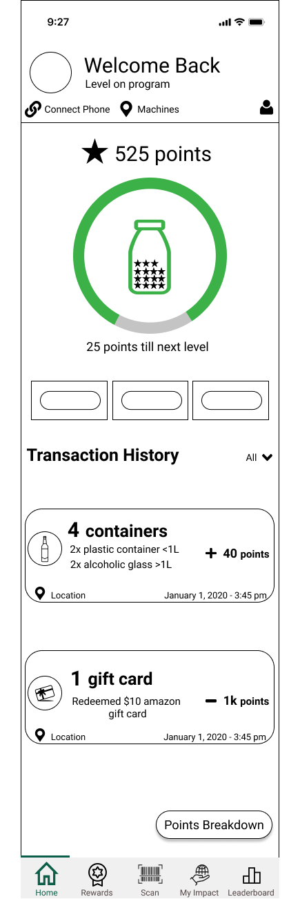
Users can collect, track, and redeem points for rewards in the form of gift cards/discount codes. They can progress through four tiers with unique perks available to each one.
02. Online Leaderboard
To keep users excited and loyal long-term users of the app, we added a gamification element where users can compete with friends on an online leaderboard based on their points.
03. Scan Container
Users can scan the barcode of any container and instantly be notified whether it can be recycled in our reverse vending machine or not. This completely takes the guesswork out of recycling.
04. Newsfeed and Impact
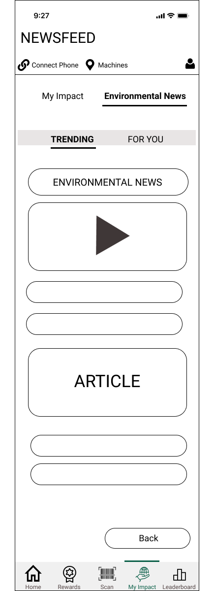
Users can scroll through environmental news on various topics related to climate change and also see the quantifiable impact they made on the environment.
Low Fidelity Prototype
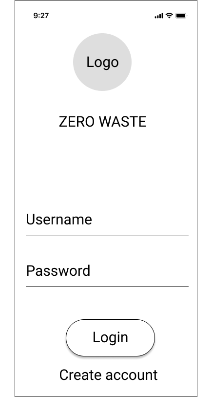
Using Figma, I created a low fidelity prototype with all of the main features for the Zero Waste mobile app.




User Testing
ITERATION 1
I conducted a series of remote usability tests on five participants within the age group of 18-34 (for each round) using my low fidelity prototype and created seven different scenarios. I recorded three main metrics which are the task success rate, time on task, and the ease of use rating on a scale from 1 to 7 (with 7 being very easy and 1 being very difficult). I encouraged users to think aloud as much as possible which helped me uncover important insights. However, I made it clear that I am not testing them as users, but rather testing the software and its user experience. This helped to take the pressure off users and make them feel comfortable.
The main features I tested were:
1) Finding the number of points a specific container would be worth in our machine.
2) Redeeming a reward.
3) Finding environmental news content.
REVAMPING THE REWARDS PAGE AND STRUCTURE
Problem
Originally, the loyalty program was structured to provide specific rewards that are exclusive to each level. As the user saves more points and progresses through the tiers, they would unlock better rewards. The rewards from the previous level would disappear. In our mind, we thought this would be most incentivizing to users. However, several users mentioned that this would be detrimental as they may have liked a specific reward at an earlier level. Users also expressed how getting better rewards wouldn’t incentivize them to get to a higher level as much as unique perks would.
Solution
We made the rewards independent of the levels and purely dependent on the number of points the user has. Likewise, we structured the unique perks for each level in a way that the higher the tier, the higher the opportunity to earn points.
ITERATION 2
IMPROVING THE POINTS SYSTEM
Problem
When asked to locate the points breakdown of a glass container greater than one liter, users instinctively clicked on the rewards tab. However, we had initially put the points breakdown on the scan page as we assumed that people who would scan their containers may want to know the per container breakdown as well. There was also confusion amongst users surrounding how to collect points, how long they would remain for, and the logistics of how earning more points would unlock levels.
Solution
We moved the points breakdown from the scan page to a “points system and breakdown” information button on the rewards page. We also added more detail to clarify how the points and loyalty program would work. We added an expiry to the points system as users interviewees mentioned they wouldn’t be incentivized to use the app after they’ve already reached the highest tier.
THE RESULTS FROM SEVERAL ROUNDS OF USER TESTING
After conducting multiple user tests with different sets of users for each round, I found that the overall usability of the app improved dramatically. I computed the average task success rate, average time on task, and average ease of use rating (7 represents 100% while a rating of 1 represents 0%).
Increase in task success
30%
Reduction in average time taken per task
Increase in ease of use rating
24.4 seconds
26%
HOW DO WE MAKE MONEY?
REVAMPING THE REWARDS PAGE AND STRUCTURE
One of the members from the team comes from a business and entrepreneurship background, So he looked into the practicality and financial profitability of this idea. We contacted local recycling manufacturing companies in the GTA to find out how much they would be willing to pay us for empty glass, aluminum, and plastic containers in bulk. Based on the figures they provided, we then structured the points program in a way that we maintain a 5-cent profit for every container.
Our business model would have several streams of revenue:
1) The bulk of our revenue would be coming from the containers themselves since our machine can hold up to 15,000 containers. Therefore, a full machine equates to a $750 profit. This can quickly multiply when you consider how fast the machines can get full in high traffic areas while factoring multiple machines.
2) We would rent out these reverse vending machines to malls, stores, and schools since they have high foot traffic. The incentive for the stores is that they could attract more customers since the machine provides individuals with points (which can be redeemed for cash), and then spent in the store itself. I contacted several stores in the area and agreed on a rent fee of $200 per month. The rent is purposely set low as it is not the main driver of revenue but rather simply to secure long-term financial stability.
3) The last stream of revenue would be through advertising other companies on the display screen of our machine, promoting the notion that they can increase their public image by being associated with an environmentally friendly company.
The Solution - Zero Waste
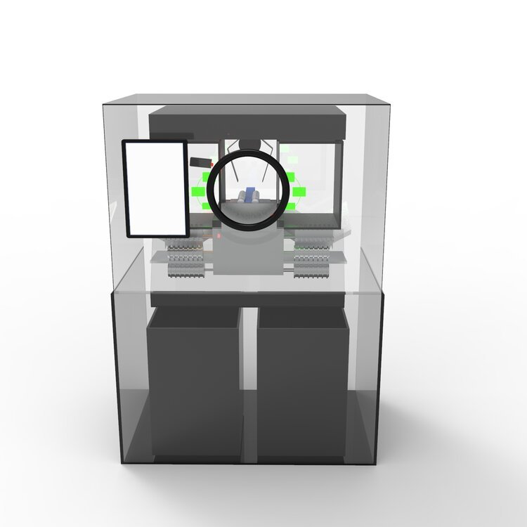
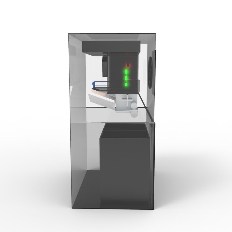
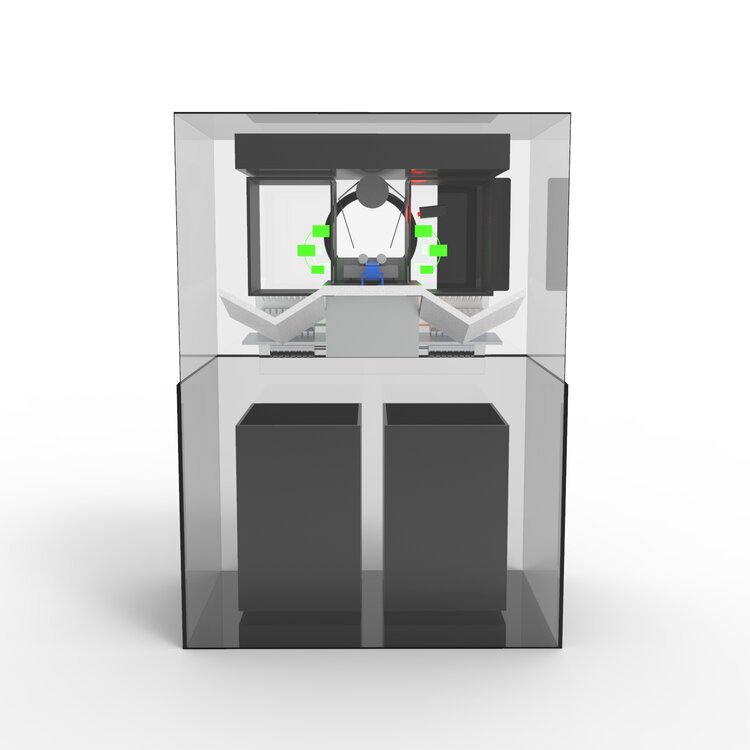
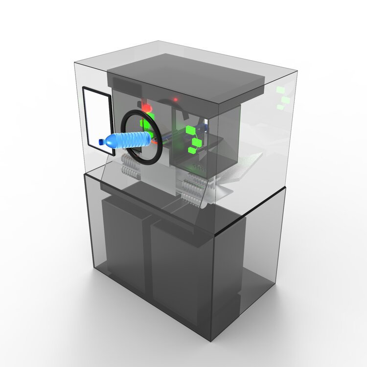
The very first see-through Reverse Vending Machine
About The Reverse Vending Machine
Using Autodesk 3ds Max, I worked with the Engineer on my team to create the 3D model of our Reverse Vending Machine. This prototype includes:
8 built-in sensors which allow for 360-degree scanning and instant detection of barcodes.
10 conveyor belts within the interior of the machine that allows for double the intake of containers a minute then competitors.
Crates at the bottom of the machine to enable advanced detection and sorting so that our machine can intake glass, aluminum, and plastic all in one solution.
High Fidelity Prototype
Using Figma, I created high-fidelity mockups of the Zero Waste Mobile App which would be used in conjunction with the Zero Waste Machine. See below for the main features of the app or view the full prototype.
Key Takeaways
My biggest takeaway was learning to not focus too much on the solution at first. Considering that climate change is a multi-faceted and complex issue, my team was overwhelmed in the beginning and didn’t know where to start. However, I learned that it is crucial to focus on the UX Design process by empathizing with the user and conducting user research which will inevitably lead to more ideas or solutions that are solving the actual problem.
I took the responsibility to keep our team prioritized on what our users want rather than what we think would be appropriate for our design. Every time our team experienced a mental hurdle surrounding our design, I brought my team’s focus back to our user research and understand who we are designing for in the first place. I learned that UX Design is a long journey that requires constant iterations and testing. Our team was ultimately one of the top 10 finalists, out of 52 other teams.
What I Would Do Differently?
1) Conduct user research with other potential demographics
My research was primarily focused on the 18-34 age demographic with an income between $0-$24,000/yr due to the tight timeline of the challenge. However, I recognize that there are users within other demographics who do not currently recycle. I would conduct user interviews and surveys with these individuals and develop another set of user personas, empathy maps, and journey maps to help guide my design decisions. I could uncover important insights that may potentially change the entire design of the app and machine.
2) Focusing more on the design of the machine
I focused primarily on the design of the Mobile App due to time constraints. However, the entire UX Design process could be applied to the display screen of the machine to ensure that users have a smooth and efficient interaction when recycling their containers. If I were to do this again, I would focus on creating low fidelity and high fidelity mockups of the machine screen, perform several rounds of user tests, and evaluate the effectiveness of my design decisions.
3) Perform further user testing and improve the final prototype
Our team was only able to conduct a Guerilla Usability test. However, I would perform further user testing methods such as A/B testing to evaluate different CTA’s, colors, designs, etc. Afterward, I would modify the prototype based on user feedback and continue the cycle again to improve the final design.


